%20(150%20%C3%97%2040%20px).svg)
How to design a world-class landing page
“Above the fold” is something you’ve likely heard, if you’ve ever designed a landing page with a growth marketer. Where does it come from?
Newspapers.
Editors have always saved this coveted space for their lead stories, because it’s what readers can see, when the papers are folded on the newsstand. The “above the fold” expression has carried over into growth marketing. With landing pages, growth marketers have made sure to keep key content above the point where you need to start scrolling.
While “above the fold” content is still important, there have been shifts in user behavior and it’s prudent to still spend time crafting the entire landing page experience.
Below, I’ll walk you through a content triangle method of building, a few less-obvious best practices, and tools to help with your testing.
Landing page content triangle
It can be easy to get lost in the forest when building a landing page, and thinking about all of the content you might want to showcase. It’s quite simple though, when you break it down into three questions that should be answered to get the almighty conversion you’re seeking:
- What?
- Who?
- How?
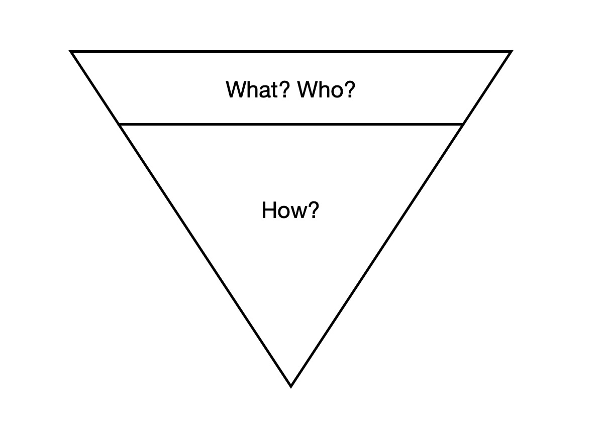
The Landing Page Content Triangle.
I’ve created this triangle to showcase the structure that your landing page should follow. Similar to building a house with a blueprint, you should follow a structure when you’re building something that more people will visit than your home.
The top portion of the triangle delineates what should go above the fold, while the bottom or below the fold, is the meat of your website.
Above the fold
While not the bulk of the website, this is the still the most important section of your site, and it gets the most eyeballs. Here, you should seek to answer:
- What does my offering do?
- Who is my offering for?
This should be answered in an excruciatingly succinct manner, because of the inherent smaller screen real estate, especially on mobile. The most common (and best!) structure that website visitors are used to includes:
- Headline that explains offering,
- Subheadline adds more context,
- Social proof logos / testimonials.

Example of Wordtune’s “above the fold” on their landing page.
Below the fold
This is the meat of your website with the most content, and gives you room to answer the following with many types of content modules:
- How does my offering do what I say?
This is where you want to make your offering shine, by showcasing your value propositions and use cases. It should leave website visitors with an understanding of how you’re going to do what you say, in the “above the fold” section.
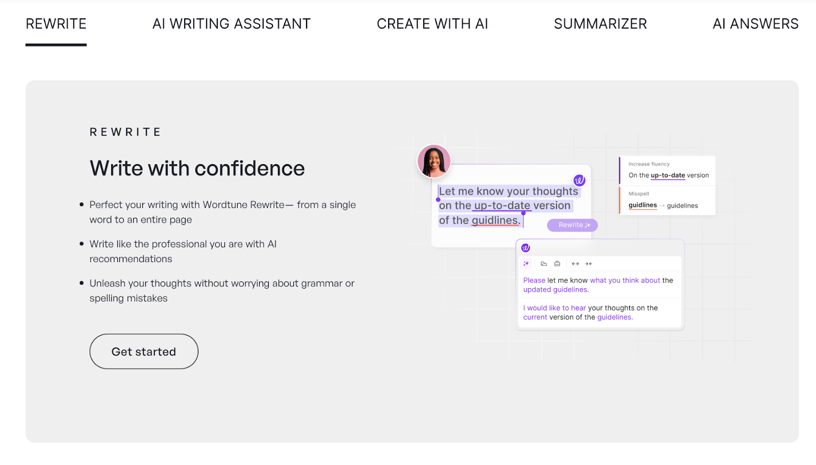
Wordtune showcasing features “below the fold” on their landing page.
In the case of a productivity tool like Wordtune, they showcase the features of their product. They are answering how their offering does what it says, through their subheadline: “Say exactly what you mean through clear, compelling and authentic writing.”
Whether your startup is a productivity tool or not, showing features, comparisons, and use cases, are a powerful method to answer the question of this section in the content triangle. You can additionally answer this question with videos, which have become a huge part of society and something that most visitors will likely be expecting.
Writing is crucial
Succinct is lovely. Clear is necessary. Parity wins.
Nobody wants to read paragraphs on landing pages anymore. Thus your strategy should be to write copy that is both succinct and clear. If you’re having trouble with this, you can add your current copy into ChatGPT and ask it to make your writing shorter. When drafting your copy, I’d advise against using superlatives like “supercharge”, because they don’t explain anything about your startup and are extremely overused across landing pages. Be clear in explaining your offerings and run it by those who have no idea what your startup is – that’s the best gauge on whether you’re being clear or not.
Outside of ensuring your writing is to the point, it’s imperative to have parity of messaging across all growth mediums that lead to your landing page. At Postmates, we took this a step further and added dynamic macros in our landing pages, which would automatically adjust headline keywords based on the search term that a visitor came in with. We also made sure there was parity across our Meta promo ads on the driver side of acquisition – so if our ad showcased X promo, our landing page also reiterated that offering and gave additional context.
When it comes to writing copy for a landing page, these three aspects matter the most: being succinct and clear, along with parity from acquisition methods.
Best practices
While there are hundreds of best practices when designing landing pages (with some being very obvious), here are two of my less obvious tips:
- Showcase the desired outcome
I highly recommend showing your customers the desired outcome being achieved. E.g. If you’re a mental health startup, show happy people, as that’s what your customer is looking for. Or if you’re a SaaS company selling a productivity tool, show someone spending their newfound time working out or doing something productive.
- Easy conversions
Reduce the friction between a user loading your landing page and converting, by crafting clear CTAs and reducing steps. A user should know exactly what they’re doing when clicking a button. I’ve seen websites use “Supercharge my growth” as a button CTA – when it really should be something like “sign up for free trial.” Tell users exactly what they’re doing and reduce the clicks needed to collect vital information like email addresses, because once you get this information, you can do so much in the form of retargeting and lifecycle email marketing.

Sonos is a masterclass at showing desired outcome (using their product) with clear CTA.
Tools to help
Now that you’ve got your landing page down, there are many amazing tools that can help you augment results even further.
The gold standard for website tracking is Google Analytics (GA) and something you’ll want to integrate right away – especially because it’s completely free. With GA installed, you can get information on where website visitors are coming from, which pages they’re checking out, and how long they’re spending on your website.
If you want to take tracking a step further, Hotjar provides heatmaps or visualizations of where visitors are spending their time on your site. It’s pretty neat and may help you glean additional insights on what’s working and not working.
When you start A/B landing page experimentation, leveraging a tool like VWO helps make testing more rapid and efficient. It’s a shame that Google Optimize was deprecated.
And there you have it!
I hope you have fun with your landing page experimentation using my tips and recommendations. It’s truly a fun growth project to take on with unlimited creative freedom.